Norwegian EV Rental Start-Up
A UX-Driven Solution to the Problems Within Automotive Rental Apps
Research & Analysis: What should be the start to every UX project
About the client:
A Norwegian venture capitalist based in Oslo, looking to create a mobile app for electric vehicle (EV) rentals in Oslo, a city at the forefront of sustainable urban transportation.The Challenge: Navigating Oslo's Unique EV Landscape
As a freelance UX/UI designer, I was presented with an intriguing opportunity by a Norwegian founder and venture capitalist. Their vision: to create a mobile app for electric vehicle (EV) rentals in Oslo, a city at the forefront of sustainable urban transportation. My objective was clear – design a user interface prototype for an EV rental app specifically for Oslo residents who, despite not owning cars, occasionally need access to a vehicle. The ultimate goal was to integrate this app with an existing platform for managing bookings, fleet, and customers.
Oslo, renowned for its compact layout and extensive public transport network, presented a unique user base—individuals accustomed to walkability and efficient public transit, not car ownership. This meant the app needed to seamlessly integrate into their existing habits, offering a convenient solution for occasional car needs.Uncovering User Pain Points: Beyond the Obvious
My design process began with thorough competitor analysis, examining major rental apps in Europe, as well as modern taxi apps to better understand their speedy and user-friendly functionalities. Through affinity mapping, I synthesised key insights:- Modern apps prioritise collecting user information upfront to minimise in-person data collection at pickup.
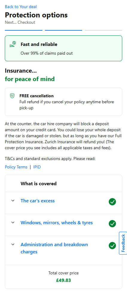
- Optional in-app insurance is a common offering, providing both convenience for users and an additional revenue stream for companies.
- Payment method integration before booking is encouraged for a smoother transaction.
- Vehicle filtering options (e.g., body type, range) are essential.
- User data is often reused for future bookings, streamlining the process.Booking.com Insurance Options Example:
To verify and validate my own research further, I explored existing research on rental apps, uncovering critical user frustrations that design could directly address:
- Hidden fees at checkout: A major source of user frustration.
- Insurance confusion: Users often struggled to understand coverage details.
- Complicated rental agreements: Lengthy and confusing terms deterred users.
- Limited payment options: Users desired more flexibility in payment methods.
- Difficulty finding nearby vehicles: Users wanted quick access to the closest car.
- Lack of social sign-up options: A barrier to quick and easy registration.
- I also encountered specific Norwegian conventions, like the option to add winter equipment. While a common element, the client decided against its implementation in the initial rollout. This highlighted the need for flexibility and strategic prioritisation in design decisions.From Insight to Impact: How I addressed and solved my problem statements created from research analysisTo ensure my design genuinely addressed user needs, I approached the research and analysis phase with a structured, problem-solving mindset. Rather than simply gathering information, I aimed to extract insight and connect it directly to design decisions that would shape a smoother, more trustworthy rental experience.I began with a thorough competitor analysis, mapping out the strengths and weaknesses of leading EV rental and taxi apps in both Norway and internationally. I focused not just on what these apps offered, but how they handled key user interactions, from onboarding to payment and vehicle discovery. Through this lens, I identified several consistent friction points: hidden fees at checkout, limited payment options, confusing insurance details, poor vehicle filtering, and slow booking processes.I translated these issues into design opportunities. For example, the widespread frustration around unclear pricing became a driving force behind my decision to make cost transparency a core element. The total price, including all fees and optional extras, is displayed clearly and persistently throughout the booking flow. This not only resolves the trust issue, but also reduces drop-off at later stages.Another insight concerned user hesitation around insurance options. Instead of overwhelming users with lengthy descriptions or technical jargon, I introduced a one-click insurance add-on during booking, using plain language and visual clarity. This simplified the process while still offering choice and control.Payment flexibility emerged as another key concern. Many users were reluctant to input card details into unfamiliar apps. In response, I designed a payment section that supports multiple options, including PayPal, and ensured that users could add or remove methods with ease. This directly addressed trust and convenience, while aligning with modern payment expectations.Discoverability was also a recurring problem in competitor apps. Users often struggled to find the nearest available vehicle or filter by what mattered most to them. To solve this, I made the closest vehicle front and centre on the homepage, and implemented intuitive filters such as range, price, and body type. These were based on observed user priorities and supported by concise icons and clear sorting options.I also encountered a more nuanced challenge around local expectations. In Norway, for example, some rental services offer winter equipment as a seasonal add-on. While we chose not to implement this in the first iteration, it informed my approach to flexibility and scalability in the design. The interface was built with future add-ons in mind, allowing new options to be slotted in without disrupting the flow or layout.Crucially, I continuously tied each design element back to the user pain points I had uncovered. I used affinity mapping to cluster related frustrations and aligned each cluster with a corresponding solution within the app. This process allowed me to prioritise features that would have the highest impact, and ensured the experience felt intuitive, responsive, and tailored to Oslo’s unique rental landscape.This research-driven process grounded the entire project in real-world needs. Every insight gathered was a stepping stone to a practical, elegant design response. The result is an app that does not just function well, but actively removes the barriers that have long made car rentals feel slow, clunky, or untrustworthy.User Persona & Biography:
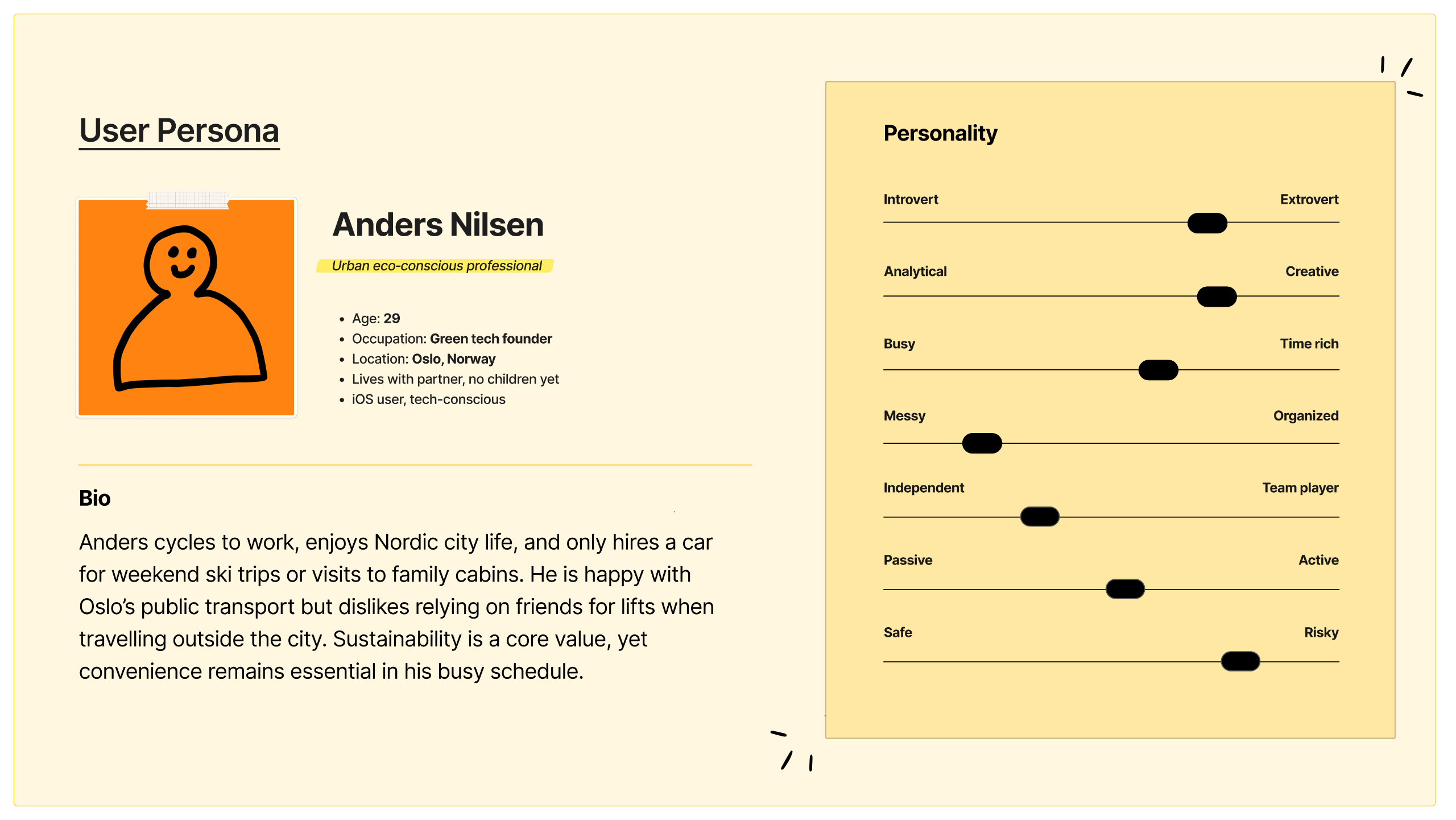
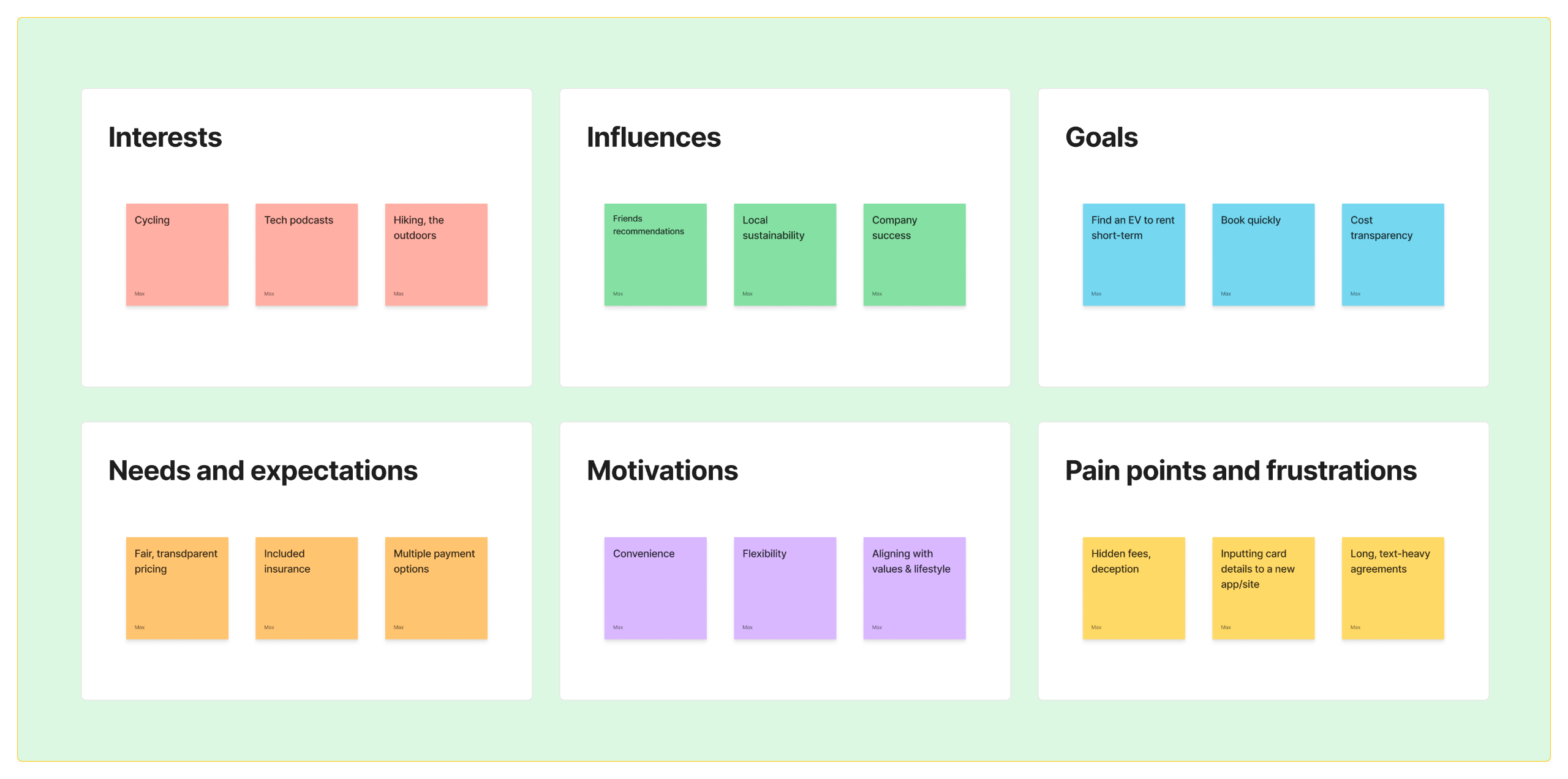
My Solution: A Human-Centred Design Approach
Setting the Stage: Effortless Onboarding
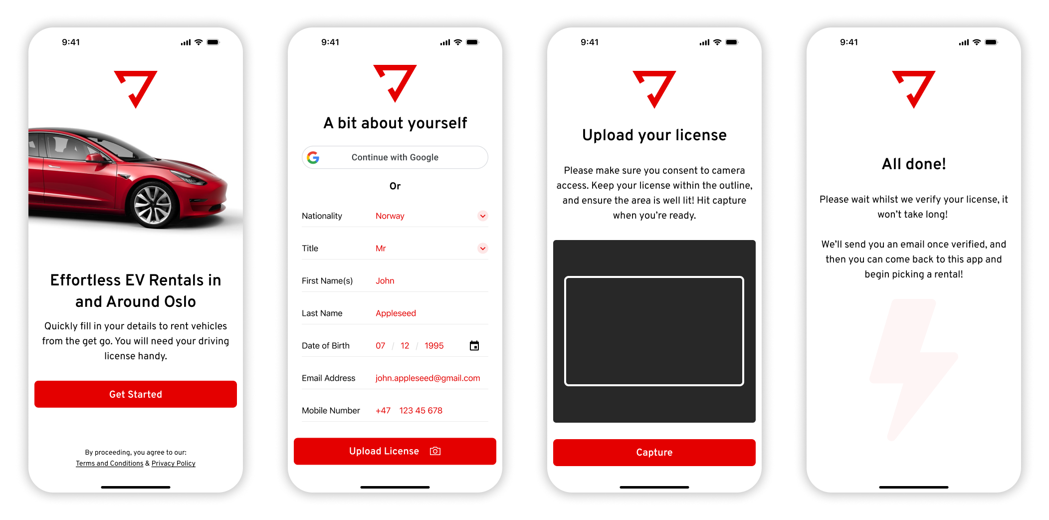
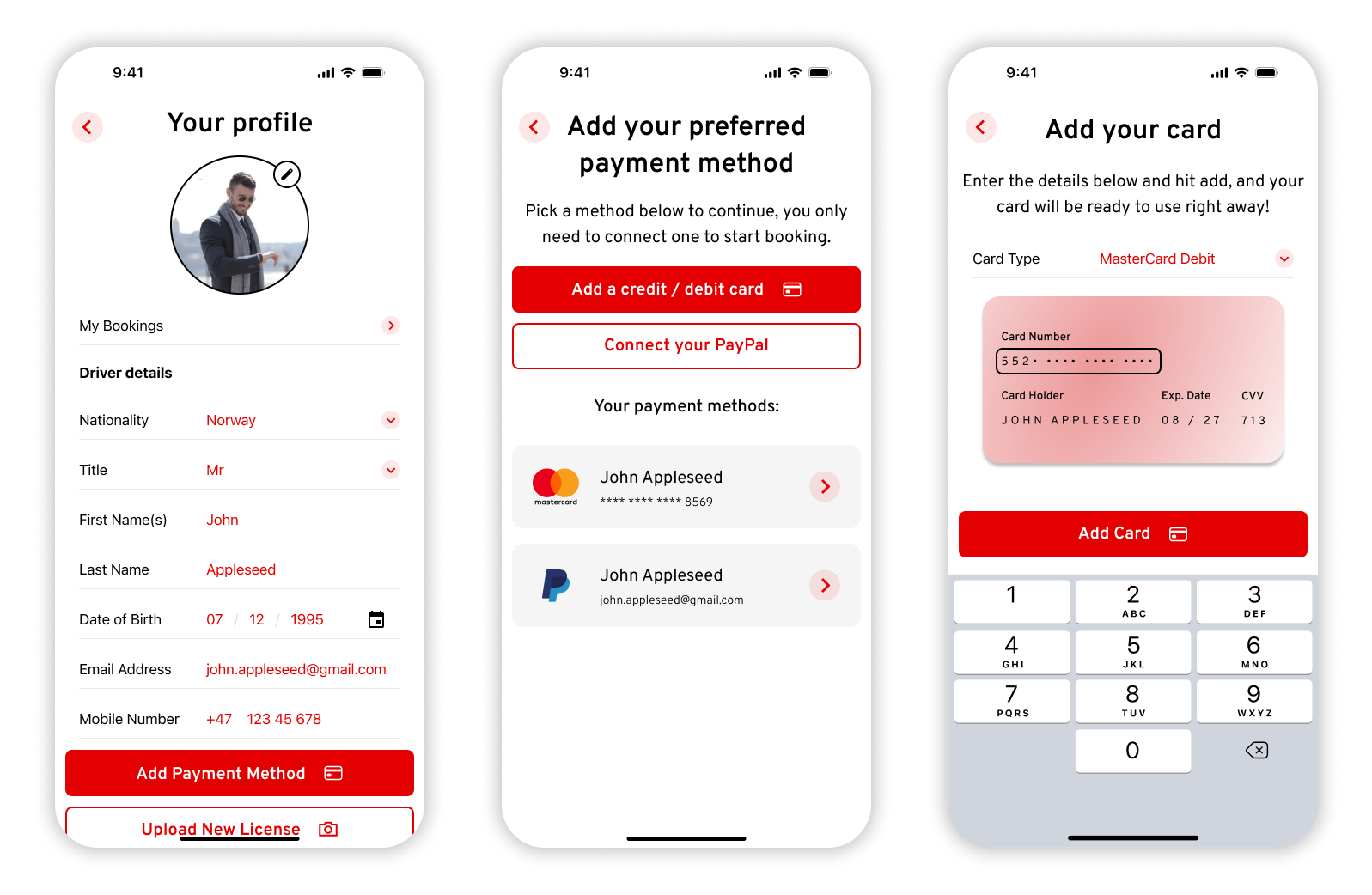
Recognising that a strong first impression is crucial, I focused on a top-notch onboarding experience. The app prioritises collecting essential user data upfront, incorporating the option for social media logins to boost trust and expedite registration. Inspired by efficient banking app systems, I designed a seamless driver's license upload process, drastically reducing time spent at the collection point. Throughout, friendly and approachable language was used to create an engaging experience, and minimal data input, leveraging device UI for numbers and selections, was implemented to prevent user errors.
Empowering Users: Personalised Profiles and Flexible Payments
A user's profile is vital for engagement and retention. I designed a personal and easily modifiable profile, allowing users to effortlessly update their information and re-upload their driver's license as needed.Crucially, the profile allows users to add multiple payment methods, including card and PayPal. This addresses user concerns about sharing card details with new apps, enhancing trust and security. The card upload process was designed to be modern, sleek, and visually appealing, aligning with contemporary software standards.
Seamless Discovery: Intuitive Home and Vehicle Views
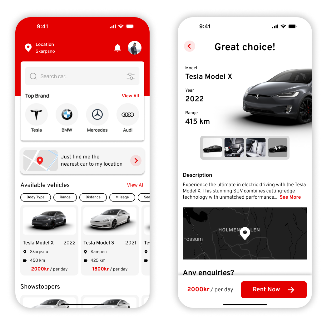
The home page acts as the app's central hub, providing quick and easy access to essential features. A key problem identified was the user's desire to find the closest vehicle quickly. To solve this, I made the "nearest available vehicle" option prominent on the home page. Users can easily see and verify their current location, ensuring relevant search results. A search bar with filtering options, along with popular brands and filters sorted by popularity, streamlines the search process.Each vehicle preview displays essential statistics and an image, enabling quick, informed decisions. Notifications for messages and updates from the rental company are also clearly visible.
The vehicle details page features a modern graphic of the car's front, overlayed with details for a unique and engaging introduction. To tackle confusion around pickup locations, a map is included, expandable to reveal the precise pickup point. Contact details, pricing, and a sticky "Book Now" call-to-action are also clearly displayed.
The Core Experience: A One-Click Booking Journey
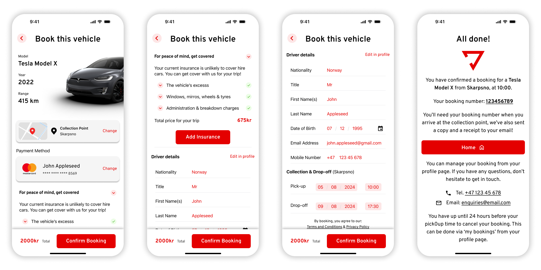
My goal for the booking process was simplicity and efficiency – a one-click experience akin to taxi-hailing apps. The booking page auto-fills previously collected information, including the default payment method. Adding insurance is a one-click option, a feature included after discussions with the team about its commonality in car rentals and its potential as a new revenue stream through commission.A critical outcome of my design was addressing the user's pain point of hidden fees. The total price is always prominently displayed, free of any hidden charges, building trust and enhancing the user experience. Upon confirmation, users receive a clear page with their reference number, contact details, and a call-to-action to return to the homepage, reinforced by a friendly confirmation message.
Looking Forward: Continuous Improvement
This project was a testament to solving real-world user problems through intuitive design and strategic decision-making. Every design choice, from onboarding to booking, was crafted to simplify the rental experience and enhance user engagement.
Reflecting on the process, I recognise the immense value of conducting dedicated user testing, especially with Norwegian users, to further optimise the app's functionality and user interface. Understanding local preferences and behaviours would be crucial for refining the app's appeal in the Norwegian market.As of now, the app is in its development phase, with each feature carefully crafted to meet user needs and exceed industry standards. My commitment remains strong: to refine and iterate based on user feedback and market insights, ensuring the final product delivers exceptional value and usability. This project has provided invaluable lessons in problem-solving, collaboration, and user-centric design, laying a solid foundation for future endeavours in app development and UX/UI design.
Let's connect on LinkedIn.